Manuscript to Print-Ready Book: Complete Typesetting Process

Have you ever opened a newly purchased book, only to immediately feel overwhelmed by cramped text, tiny margins, or distracting layouts? As an author, the last thing you want is for poor formatting to ruin a phenomenal story. Creating a seamless, immersive reading experience relies heavily on mastering the manuscript-to-print conversion process.

Typesetting isn’t just about picking an elegant font; it is the visual architecture of your physical book. Whether you are collaborating with a professional interior designer or bravely tackling the layout software yourself, understanding this transition is essential. Here is your complete guide to the typesetting process, from raw text to a flawless, print-ready PDF.

Key Takeaways

  • Typesetting creates the visual hierarchy and layout of your physical book.
  • Professional typesetting requires specialized software; word processors like MS Word often fall short.
  • A print-ready PDF must embed all fonts, flatten transparencies, and ensure images have a resolution of at least 300 PPI (often called 300 DPI) at their final printed size.
  • The typesetting phase is when you must integrate your official ISBN and barcode.

What is Typesetting?

Book Typesetting

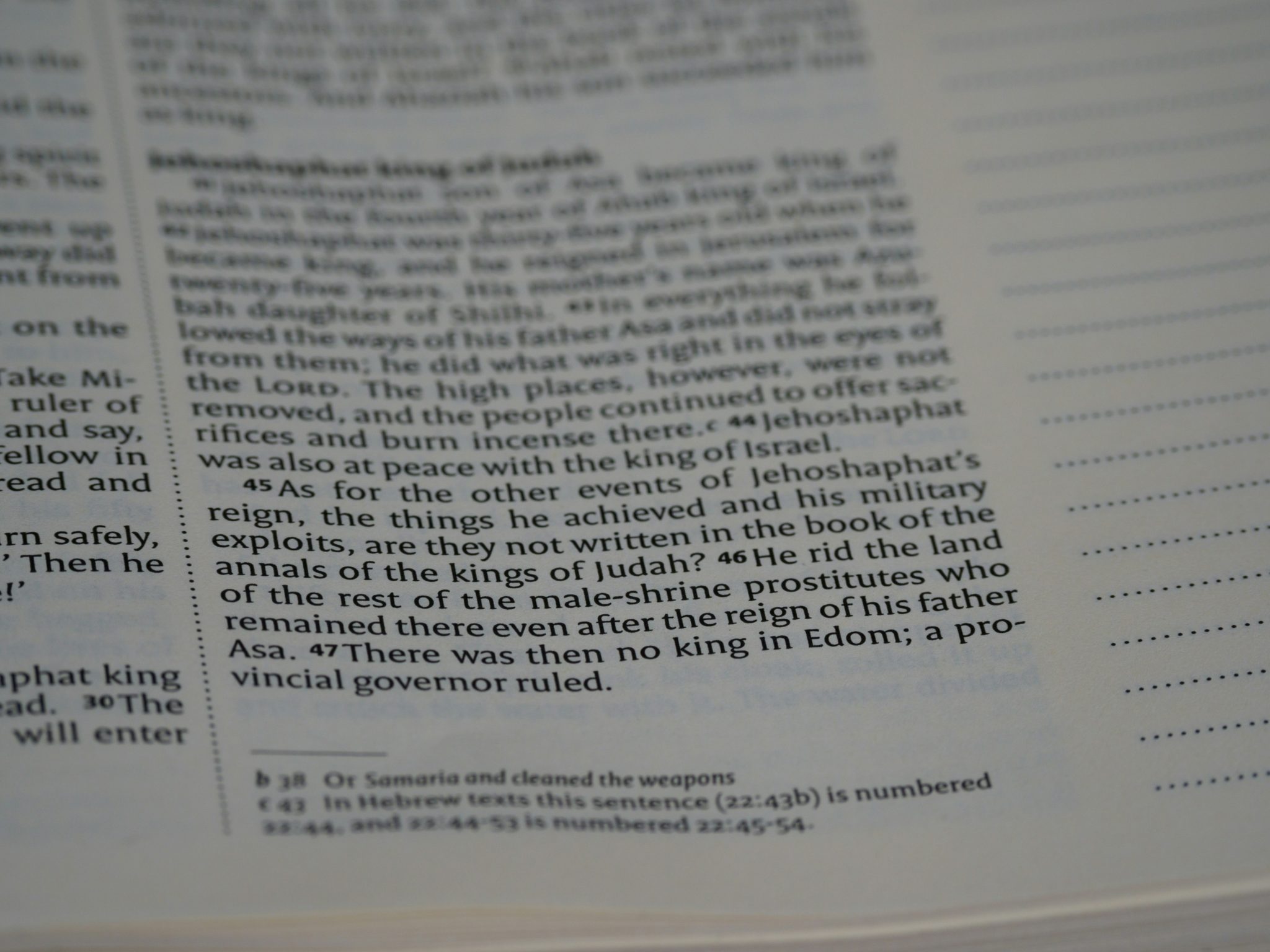
Typesetting is the art and science of arranging text on a page. It goes far beyond simply choosing a nice font; it involves creating a visual hierarchy, ensuring readability, and designing a layout that adheres to traditional publishing standards. A poorly typeset book screams “amateur,” while a well-typeset book allows the reader to get completely lost in the story without visual interruptions.

Here are the steps to convert a manuscript to Print-Ready Book:

1. Manuscript Preparation and Clean-Up

Before any design work begins, the manuscript must be scrubbed of messy, hidden formatting.

  • Remove manual spacing: Delete double spaces after periods, manual tabs used for indents, and extra return keys between paragraphs.
  • Standardize styles: Apply consistent paragraph styles (like “Heading 1” or “Normal”) rather than manually bolding or enlarging text.
  • Finalize text: Ensure the manuscript has been thoroughly copyedited and proofread. Making textual changes after the typesetting process begins is time-consuming and risks introducing formatting errors.

2. Choosing Trim Size and Setting Margins

Your book’s trim size (the physical dimensions of the printed book) dictates everything else in the layout. Standard fiction sizes are usually 5″ x 8″, 5.25″ x 8″, or 6″ x 9″. Once the trim size is selected, you must set the margins.

  • The Gutter: The most critical margin in a print book is the inside margin (the gutter). It must be wide enough so that words don’t get swallowed by the book’s binding. Gutter size scales with page count: shorter books (under ~150 pages) typically use 0.375 to 0.5 inches, while thicker books (400+ pages) may need 0.75 to 0.875 inches or more.
  • White Space: Generous outside, top, and bottom margins (typically around 0.5 inches) give the reader’s thumbs a place to rest and make the page look elegant rather than cramped.
  • Bleed: If your book contains images that stretch to the very edge of the page, you must include a “bleed” (usually an extra 0.125 inches added to the page edges) so the printer can trim the pages cleanly without leaving a white border.

3. Typography and Spacing

This is where the magic of manuscript-to-print conversion really shines.

  • Font Selection: Print books generally use serif fonts (like Garamond, Minion Pro, or Palatino) for body text because the “feet” on the letters guide the eye along the line.
  • Leading (Line Spacing): The vertical space between lines of text needs to be precisely calculated to prevent the page from looking too dense or too airy.
  • Justification: Most professional print books, including fiction and non-fiction, use justified text (flush on both the left and right margins), while poetry typically uses left-aligned text because line breaks carry meaning. Justification requires careful tracking (spacing across a block of text) and kerning (spacing between individual letters) to avoid awkward gaps (rivers of white space) between words.

4. Designing Front and Back Matter

A book is more than just chapters. Your layout must include standard publishing sections:

  • Front Matter: The half-title page, title page, copyright page, dedication, table of contents, and preface. These are typically numbered using lowercase Roman numerals, though the first few pages utilize “blind folios,” meaning the page numbers are counted but purposefully hidden from view.
    • The ISBN Integration: Step 4 is the exact phase where you must insert your officially registered ISBN (available through your country’s official ISBN agency, such as Bowker in the United States or Nielsen in the United Kingdom) onto your copyright page. If you are preparing the full cover file alongside your interior, this is also when your ISBN barcode is placed on the back cover.
  • Back Matter: Acknowledgments, author biography, bibliography, or index.
  • Chapter Openers: Designing how chapters begin, using drop caps, stylized chapter numbers, or unique starting points (e.g., starting a third of the way down the page), gives your book a unique personality.

5. Hunting Widows and Orphans

A key part of professional typesetting is eliminating typographic errors that disrupt the reading flow:

  • Widows: The last line of a paragraph stranded alone at the top of a new page (a widow has no future, since the rest of her paragraph lies on the previous page).
  • Orphans: The first line of a paragraph stranded alone at the bottom of a page (an orphan has no past, since the rest of the paragraph appears on the next page).
    Note: definitions vary across style guides, but this is the most widely cited convention. Professional typesetters slightly adjust letter spacing or rewrite sentences to pull these stray lines back into the main block of text.

6. Exporting to a Print-Ready PDF

While some Print-on-Demand (POD) platforms like Amazon KDP will technically allow you to upload Word documents (with varying, often poor results), professional printers require a final export into a high-resolution, print-ready PDF. This file embeds all fonts, flattens any transparent elements, ensures all interior images are formatted to a crisp 300 PPI (commonly referred to as 300 DPI) at print size, and locks the layout in place so it looks exactly the same on the printer as it does on your screen.

Conclusion

Transforming a digital file into a beautiful, physical book is a journey of precision and art. The manuscript-to-print conversion process might seem daunting at first glance, but it is the critical bridge between a raw draft and a professional, shelf-ready publication.

Whether you choose to learn professional layout software like Adobe InDesign yourself or hire an experienced typesetter, investing time and resources into this final polish ensures your story receives the presentation it deserves. And remember, before you finalize that beautiful interior, ensure you have secured your ISBN from companies like ISBN Services to make your book officially ready for retail. Ultimately, good typesetting is invisible; your readers shouldn’t notice the margins, fonts, or spacing; they should only notice how effortlessly they get lost in your words.

Frequently Asked Questions

Q: How long does the manuscript-to-print conversion take?

A: It depends on the complexity of the book. A standard text-only novel might take a professional designer a few days to a week to format, typeset, and revise. Non-fiction books with charts, footnotes, images, and indexes can take several weeks. If you are learning the software on your own, expect a steeper learning curve and a longer timeline.

Q: Can I just use Microsoft Word to typeset my print book?

A: Technically yes, but it is highly discouraged for professional-level print design. Word is a word processor, not a page layout program. It lacks granular control over kerning, hyphenation, widows/orphans, and image management. Industry professionals use software such as Adobe InDesign or Affinity Publisher, while many indie authors prefer dedicated book-formatting software such as Vellum or Atticus.

Q: What is the difference between formatting for an eBook and typesetting for a print book?

A: EBook formatting is fluid, while print typesetting is static. The text in an eBook changes size and shape depending on the device the reader is using (Kindle, iPad, phone). It requires a dynamic, simplified HTML-based format (EPUB). Typesetting for print is static. You are locking in the exact visual layout for a specific paper size, which gives you absolute control over typography, pagination, and visual design. You cannot use a PDF as an eBook, and vice versa.

Q: Where does my ISBN go during the typesetting process?

A: Your 13-digit ISBN is typed directly onto the copyright page in the front matter of your book’s interior file. A scannable barcode graphic of that same ISBN must also be placed on the bottom back cover of your separate cover file.

Share This Post

More To Explore

We Can Help

drop us a line and keep in touch

Cyber Monday Offer End In

Hours
Minutes
Seconds