Have you ever picked up a book, read the first page, and felt something was… off? The cover was gorgeous, but reading the pages felt like a chore. The text was crammed, margins were razor-thin, and your eyes ached after ten minutes. You might not have known the exact word for it, but you were experiencing the harsh reality of bad book typesetting.
For self-published authors, ensuring your print book layout and eBook formatting look as professional as a traditionally published title is crucial. Poor design screams “amateur,” while great design pulls readers effortlessly into your world. But what exactly does the process entail? Let’s dive in.
Book typesetting, often referred to as book layout design, is the process of arranging text and images on a page using specialized software to ensure maximum readability and an aesthetically pleasing design. It bridges the gap between your raw manuscript and the final, print-ready or digital book.
Historically, typesetting was a highly physical process involving arranging metal type, individual letters, and punctuation to print a page by hand. Today, it goes far beyond choosing a nice font in Microsoft Word and hitting the “justify” button. It is the visual architecture of your manuscript’s interior. It dictates how the text flows, how comfortable the human eye is tracking from line to line, and how the book visually communicates its genre.
Often, people use the terms “formatting” and “book typesetting” interchangeably, but they represent different stages of production.
You might wonder if this meticulous process is really worth the effort, especially when juggling marketing and writing. The short answer is an absolute yes.
If you are tackling this process yourself, you must understand the foundational rules. Ignoring these leads to an unreadable final product.
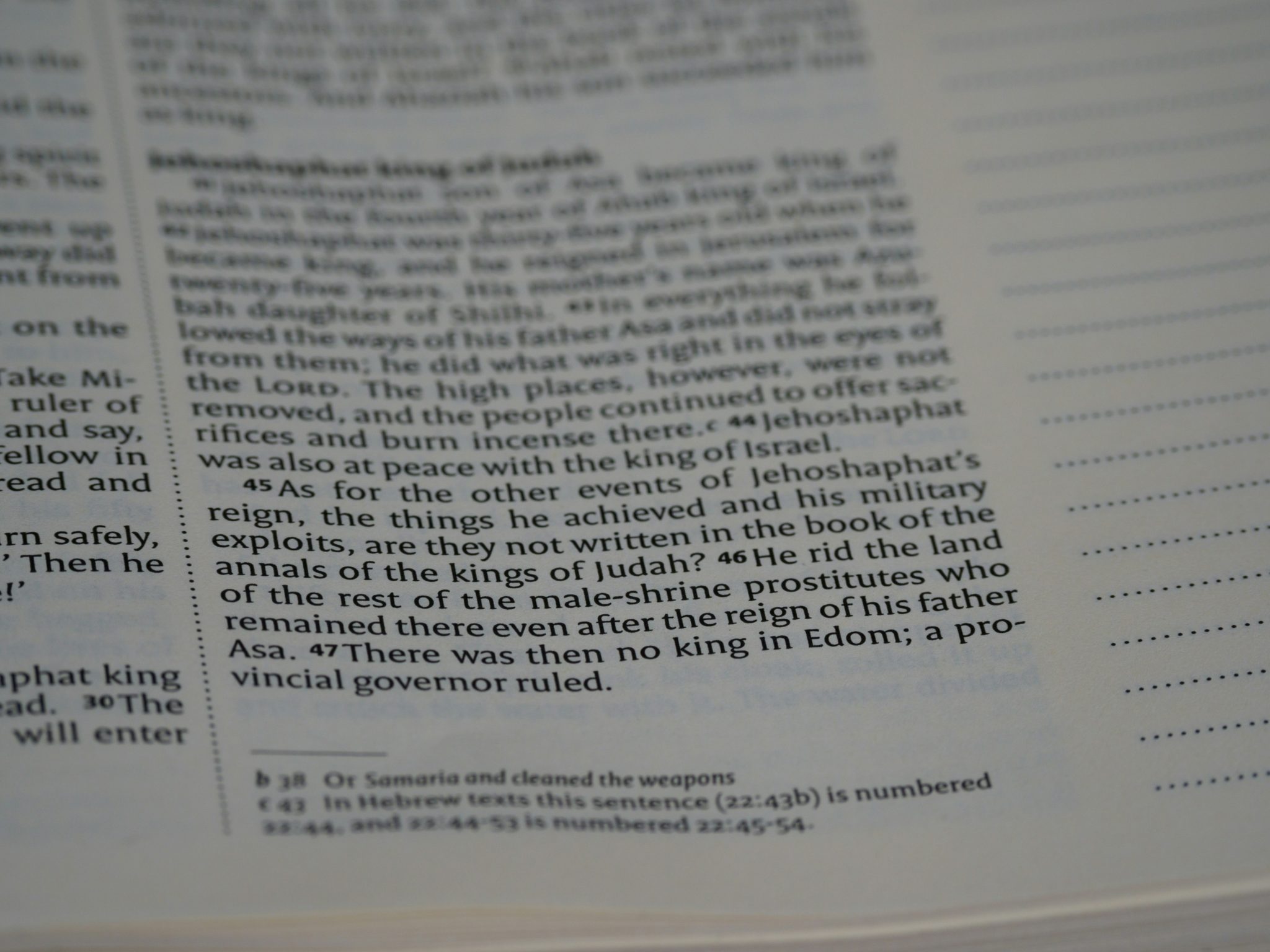
When discussing the finer details of page layout, we have to mention widows and orphans. These are typographic errors that interrupt the flow of reading, and they are the absolute bane of a typesetter’s existence.
They break the reader’s concentration by drawing the eye to awkward blank spaces. Fixing them involves subtly adjusting tracking so text flows perfectly from one page to the next.
Should you typeset your book yourself or outsource it? This depends on your budget and technical skill.
If you want to handle the interior yourself, you need the right tools. Microsoft Word is rarely sufficient for a professional print book layout. Instead, authors use:
If learning typesetting software feels overwhelming, hiring a professional book interior designer is a great investment. Depending on the length of your book and the complexity of the design (e.g., nonfiction with charts vs. standard fiction), professional typesetting typically costs anywhere from $150 to $500+.
While adjusting margins and fonts is critical, your book isn’t ready for publication until the administrative pages are perfectly laid out. Your copyright page layout is a non-negotiable part of the typesetting process.
This page typically sits directly behind the title page and must include your copyright notice, edition information, publisher details, and most importantly, your ISBN (International Standard Book Number). Furthermore, your typesetter will need your 13-digit ISBN to generate the barcode that sits cleanly on the back cover of your print book.
Typesetting might seem like another technical chore on your long list of author responsibilities, but it is the bridge between a good story and a great reading experience. By respecting the craft of typography and layout, you elevate your self-published novel to stand shoulder-to-shoulder with traditionally published bestsellers. Take the time to get your interior looking sharp, secure your ISBNs, and hit publish with confidence!
Q: Can I typeset my book using Microsoft Word?
A: While you can format a basic manuscript in Word, it isn’t designed for professional book layout design. It lacks micro-typography controls for precise kerning, advanced hyphenation, and automatic widow and orphan management. Programs like Adobe InDesign, Vellum, or Atticus are much better suited for the job.
Q: Does the genre of my book dictate the font I should choose?
A: Yes, absolutely. Font choice is a subtle psychological cue. For an epic fantasy or historical fiction, a classic, elegant serif font (like Garamond or Caslon) conveys a sense of history. For modern sci-fi or a tech-thriller, a crisper serif or clean sans-serif feels more appropriate.
Q: What is the best font size for a printed book?
A: For most adult fiction and nonfiction, the industry standard font size ranges between 10pt and 12pt, depending on the specific typeface chosen.